I wrote a blog post about Defect Analysis, a analysis technique to get insights into how buggy your system might be.
Blog post about Defect Analysis using pandas


I wrote a blog post about Defect Analysis, a analysis technique to get insights into how buggy your system might be.

I wrote a Jupyter notebook that demonstrates how you can easily use pandas together with pygal. Because it won’t work here on my blogging system, you have to read about it on GitHub: Jupyter notebook HTML export (fully interactive version)

People at conferences and meetups often ask me what I would recommend to learn X or Y. And I’m always happy to give some suggestions depending on the experience level of the person that asked. Unfortunately, this doesn’t scale very much, so here are my general recommendations on learning something very effective. This time: pandas.

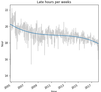
In this blog post / notebook, we want to take a look at how much information you can extract from a simple Git log output. We want to know where the developers come from, on which weekdays the developers don’t work, which developers are working on weekends, what the normal working hours are and if the is any sight of overtime periods…

In this blog post, I want to show you how you can visualize the contributions of developers to your code base over time. I came across the Stream Graph visualization and it looks like it would fit quite nicely for this purpose…